Since the outbreak of the Covid-19 pandemic, there has been increased interest in the impacts of disease on states and societies, including in the past. At the same time, the pandemic has given renewed vigor to the digitization of research materials, including archives, making them available to researchers despite limits to travel. In this context, researchers at the Indian Ocean World Centre (IOWC), McGill University, have begun to re-examine histories of disease in nineteenth-century India. My contribution to this project, which is part of a wider SSHRC Partnership entitled Appraising Risk, has been to collect and standardize data on disease in India from online archives. Then, in the same scholarly vein that underpins the digitization of materials, I have sought to visualize changes over time using QGIS, a free and open-source Geographic Information System (GIS) for making digital maps, including time-lapses: Digital source materials beget digital research outputs.
I accessed data on disease in nineteenth-century India from three main repositories: the British Library, the Scottish Library, and the Digital South Asia Library. Data from each library is stored in different ways. For example, the Digital South Asia library has a separate page for its disease data, which is organized by date. By contrast, the British Library has an excel spreadsheet with over 15,000 reports on various topics, ranging from texts on leprosy to case studies on chemical manufacturing. Between these extremes, the Scottish Library has an entire page dedicated to the medical history of British India and differentiates its 426 reports on medicine with categories, such as medical advancements, institutional medicine at hospitals, and vaccination rates. Thus, accessibility for researchers with a particular interest in specific diseases varies between repositories. Nevertheless, digital data mining and searching techniques enabled reasonably quick access to disease-related data when it was unreasonable to expect to read through every document.
Once I had collated the relevant documents, new challenges emerged. The primary among them was that British colonial officials recorded data about disease in a variety of ways. For example: Some data were qualitative, while some were quantitative; some officials recorded numbers of deaths only, while others provided data on numbers of cases or of hospital admissions, numbers of deaths per area of land, or numbers of deaths per 1,000 within a given period – either a year or a month.
These discrepancies meant that gathering an analyzable account of deaths for any given disease necessitated combining data from multiple tables or reports and standardizing them, making each datapoint interoperable. Having combed through the data, it quickly became apparent that the best way to visualize it was in terms of numbers of deaths per 1,000 per month. Several data points were already in this format, those that used an annual scale could easily be converted, and census data from 1872, 1881, and 1891 – while sometimes incomplete and contradictory – could be used to calculate a reasonable estimation. This categorization allowed for a visualization of outbreak severity of different diseases in various locales, while accounting for divergent population density in rural and urban areas.
Through these methods, I created 9,200 georeferenced and time-stamped data points on the three deadliest diseases recorded in nineteenth-century India: cholera, smallpox, and ‘fevers.’ Then, using a pivot table, I divided the dataset along geographical and temporal lines to reveal the transmission and deadliness of each disease. From this point, the central characteristics of each outbreak became apparent, and it was possible to determine the time of year diseases were most lethal, years when certain diseases were more prevalent, and which diseases were predominant in which regions. The information highlights how climatic events and seasonal variations interact with the prevalence of disease. It can also, therefore, inform policy decisions by individuals, organizations, and governments made during the different parts of the year to assess risk and counteract the possibility of higher death rates.
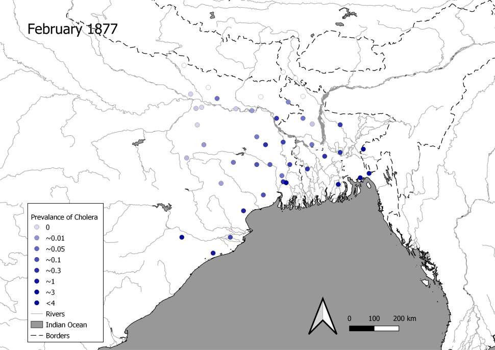
Such outputs are visible in the timelapse of the disease data I collected and standardized. To take one example, maps 1-12 show the prevalence of cholera in West Bengal from October 1876 to September 1877, during which there was an epidemic. These images inform historians how disease travels and is influenced by the monsoon system.
For example, the prevalence of cholera in West Bengal was at its lowest following the south-western monsoon, which brings most of the region’s rainfall. However, as conditions turned to drought, cases of cholera began to rise along the coast, principally in the Ganges-Brahmaputra-Meghna Delta region of present-day Bangladesh. The fatality of cholera reached its peak along the coast in January and February. However, as the season again changed, the prevalence of cholera flowed inland along the rivers, which people used to migrate, and in May and June, the entire region of West Bengal and Bangladesh was severely affected. Once the southwest monsoon returned in 1877, deaths from cholera dropped significantly along the coast, and cholera occurred more regularly along the border of modern-day Nepal, especially alongside the Ganges River – a major corridor linking coastal and inland regions. Using GIS, historians can map the incidence of cholera and observe the wave-like circulation of cholera in West Bengal, highlighting the centrality of the monsoon system and travel in turning localized outbreaks into region-wide epidemics.
Maps 1-12: Prevalence of Cholera in West Bengal October 1876 – November 1877
Figures reflect number of deaths per one thousand people per month
Map 1:

Map 2:

Map 3:

Map 4:

Map 5:
Map 6:

Map 7:

Map 8:

Map 9:

Map 10:

Map 11:

Map 12:

There are, nevertheless, gaps in the dataset. All the data is disproportionately located around important colonial nodes, especially Bombay (Mumbai), Madras (Chennai), Calcutta (Kolkata), and wider Bengal. This is partly evident from the lack of data to the west of the maps 1-12. Furthermore, even within the contexts for which data is relatively abundant, there is a great deal of unevenness. For example, there is an absence of reporting on cholera in West Bengal between 1856 and 1871.
Of course, this does not reflect that cholera was absent from this locale in these years; rather, the original documents containing this information have yet to be digitized and/or put online. As more of these accounts are digitized and published, however, new technologies and methods in data and GIS science will allow historians to extend this initial study. Alternatively, ‘in-person’ research at the British Library, Scottish Library, and elsewhere could begin that process now.
This project’s data will be made freely available on the Appraising Risk website.
Feature Image Credit: Pope, G. U. (1880) Text-book of Indian History: Geographical Notes, Genealogical Tables, Examination Questions, London: W. H. Allen & Co. Pp. vii, 574, 16 maps. Accessed via: https://commons.wikimedia.org/wiki/File:Pope1880BengalPres2.jpg
Alexander Springer
Latest posts by Alexander Springer (see all)
- A GIS Approach to a History of Epidemics in 19th Century India - March 15, 2023